Most people lose a Christmas jumper competition before they have even bought the jumper, because they optimise for the wrong thing. Clever rarely wins. Visible, committed and slightly ridiculous wins.
Judges are working from across a room, quickly
A competition is usually judged by someone glancing round a crowded room, not by someone reading a slogan up close. That single fact should decide most of the purchase. A small chest graphic or a clever line of text loses to something legible from fifteen feet away, every time. An all-over 3D print beats a modest one for exactly this reason — it reads as a full costume rather than a jumper with a picture on it, and coverage photographs as effort in a way a chest panel cannot.
Sincerity beats irony
The reason a jumper is funny at all comes down to incongruity — the gap between an ordinary garment and an absurd decision layered on top of it. A jumper worn with a knowing smirk closes that gap before the judge has even looked properly; a jumper worn with total, straight-faced commitment leaves it wide open. The full explanation is in the psychology of why ugly Christmas jumpers make us laugh, and it has a direct, practical payoff: act like you think it looks great, because in a strange way, that is what makes it funny.
Movement and texture beat a flat print
Sequins, real knit texture, or genuine light-up elements all catch attention in a way a static printed graphic cannot, because they change as you move rather than sitting still. A jumper that does something — flashes, glitters, has genuine dimensional texture — holds a judge’s attention for longer than one that is simply loud once and then static.
Novelty over familiarity, within reason
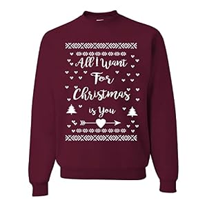
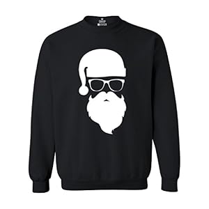
If eight people in the room have bought the same generic reindeer sweatshirt, the ninth person wearing it does not stand out however good it is. An unusual pairing — a genuinely odd design rather than the most obvious festive motif — gets noticed precisely because a judge has not already seen it four times that afternoon.
Fit and finish, not just the graphic
A jumper that fits badly undercuts everything else about it — sleeves too short, hem riding up, a graphic distorted because the size is wrong. Getting the size right before the day is not a small thing. See why your Christmas jumper arrived two sizes too small and check the actual measurements rather than trusting the label, especially with the loud marketplace prints that tend to win on visibility.
The five-point checklist
- Legible from across a room — an all-over print or a large simple graphic, not a small chest panel
- Worn with complete sincerity — commit fully, no ironic distance
- Has movement or texture — sequins, real knit, or genuine lights, not just a static print
- Different from what everyone else is likely wearing — check what’s popular and go the other way
- Actually fits — checked against the real measurement, not the label
None of this guarantees a win — a judge’s taste is a judge’s taste — but it is what consistently separates the jumpers people remember from the ones nobody mentions again after the party.